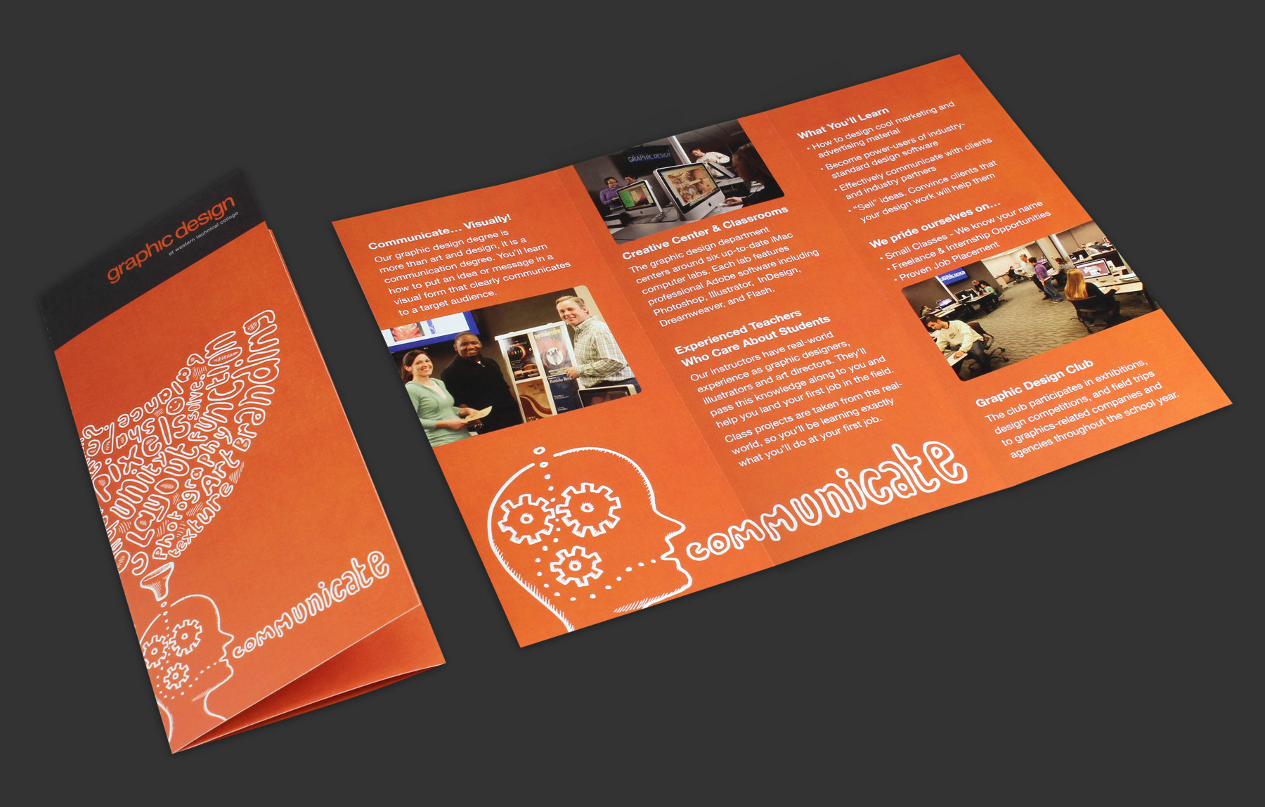
This brand identity was created for Western Technical College's graphic design program where I teach design, Illustration, and web design. We need a strong, identifiable brand to demonstrate to our students that we take our work seriously—and we know how to do what we teach.
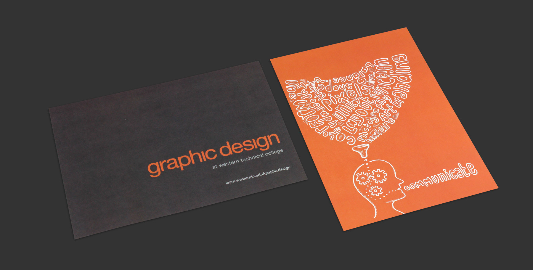
My goal was to create a professional and sophisticated look that would be timeless. A logotype had been used in the department before, so I felt the simplicity of it would work well when used with other art and photo elements. It also seemed to work well in a variety of different layouts and marketing products.
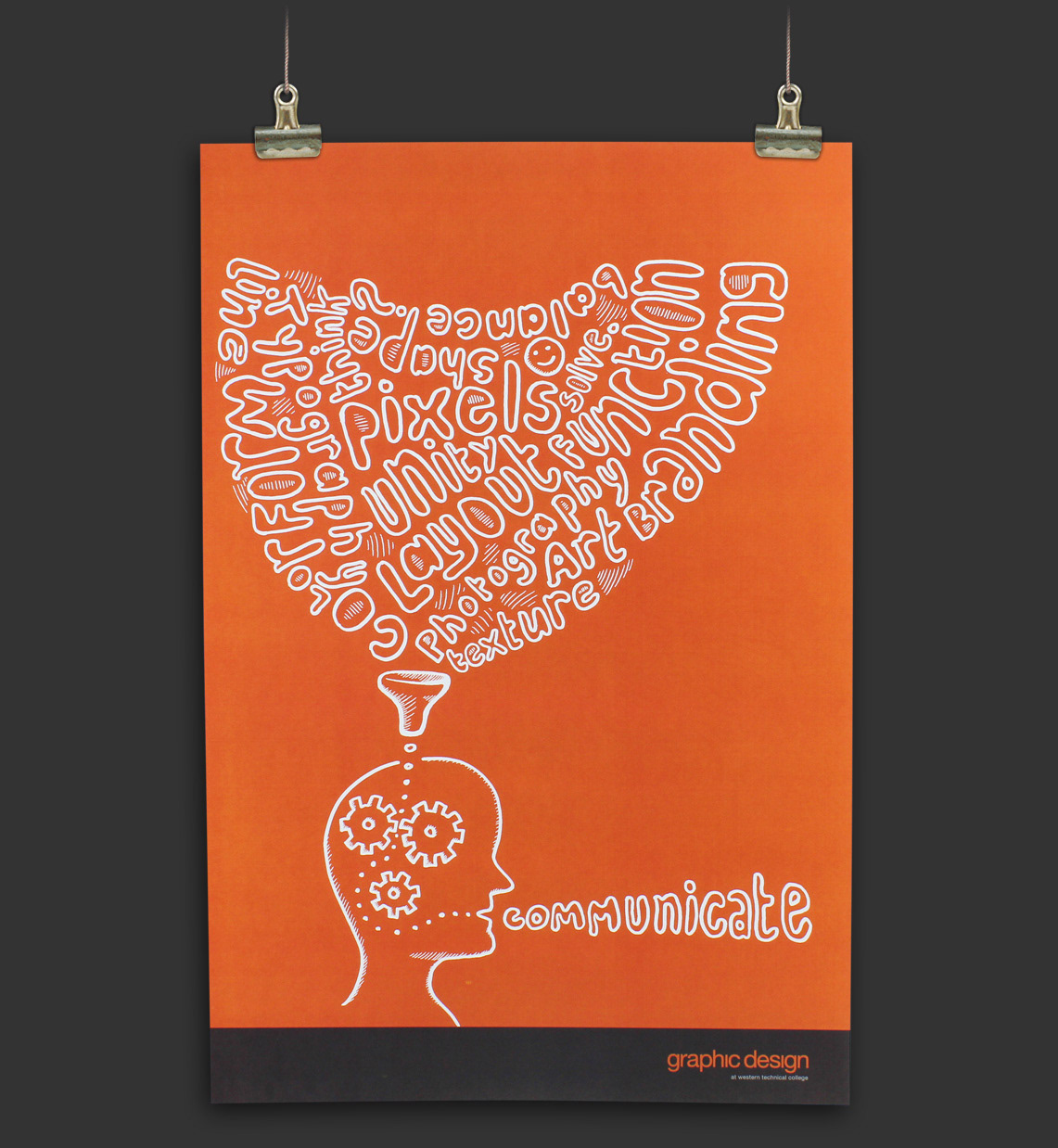
I chose the dark gray because of the sophistication it offers and orange because it's a creative and inspiring color. I like how the two work together. I planned to feature a lot of colorful student artwork on our department website, so I thought neutral colors would work best and not compete for attention.
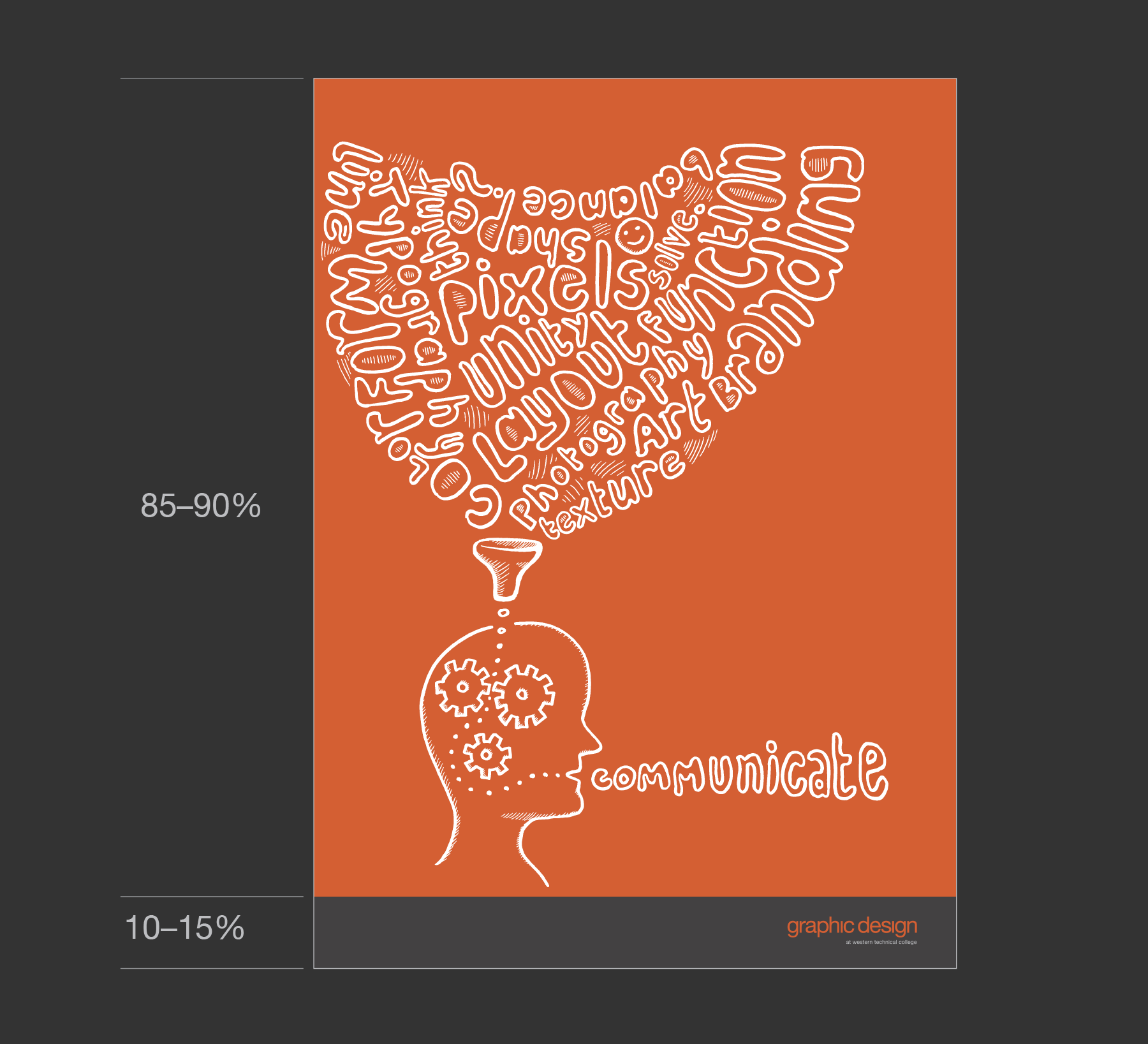
As for the illustration, I was trying to create an image that would represent the essence of our industry. The "gear head" image is what I came up with. I liked the organic feel of the drawing and how it symbolized natural hand skills and creativity.